UI Customization
Customize how dialogue appears in your game. DialogueCraft ships a ready-made RPG UI template prefab and a base class for building entirely custom UIs. Additional templates are planned for future releases.
Built-in Templates
Templates live in Runtime/UI/Templates/ and inherit from DialogueUIBase. Add them from the Hierarchy menu under GameObject > CraftWorks > DialogueCraft.
RPGDialogueUI
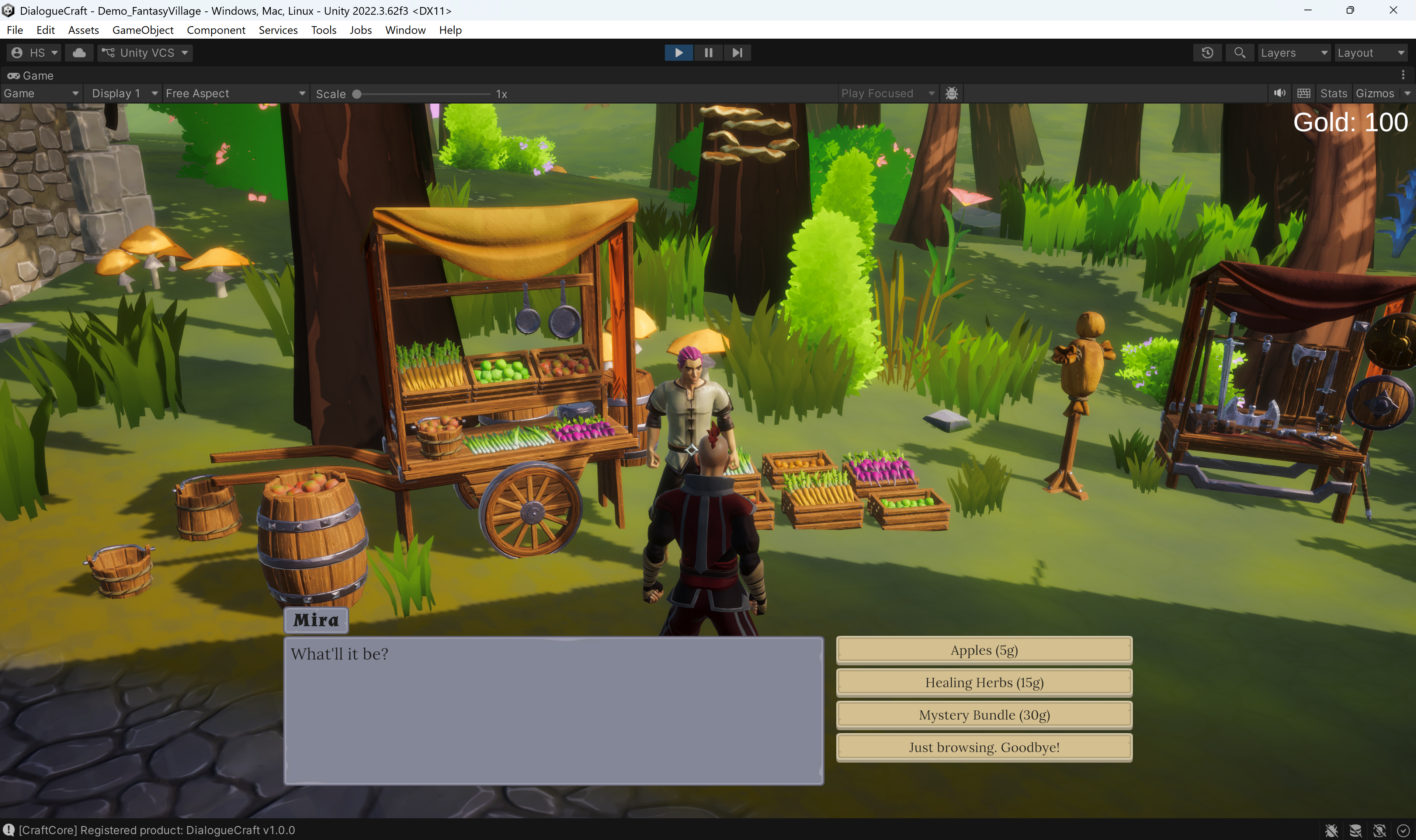
Classic bottom-of-screen panel with character portrait, name plate, and scrolling text. Suited for JRPGs, CRPGs, and adventure games.
| Field | Type | Purpose |
|---|---|---|
dialogueRoot | GameObject | Root container toggled on show/hide |
nameText | TextMeshProUGUI | Speaker name display |
namePlate | GameObject | Name plate background (hidden when no speaker) |
dialogueText | TextMeshProUGUI | Main dialogue text |
portraitImage | Image | Character portrait |
continueIndicator | GameObject | Arrow or icon shown when waiting for input |
choicesContainer | Transform | Parent for spawned choice buttons |
choiceButtonPrefab | GameObject | Prefab instantiated per choice |
hidePortraitWhenEmpty | bool | Hides portrait when no character is assigned |
clickToContinue | bool | Advance on mouse click, Space, or Enter |
useCharacterNameColor | bool | Tint the name text with CharacterData.nameColor |
Input: Left-click, Space, or Enter advance dialogue when clickToContinue is true. Input is ignored while choices are visible.
Upcoming Templates
The following templates are included in the codebase but are not yet demo-ready. They are fully functional and can be used in your project, but do not have dedicated demo scenes or prefabs yet.
| Template | Class | Style |
|---|---|---|
| Minimal | MinimalDialogueUI | Floating dark box, no portrait, inline speaker name |
| Bubble | BubbleDialogueUI | World-space speech bubble that tracks a target transform |
| Visual Novel | VisualNovelDialogueUI | Full-screen layout with character sprite positions (left/center/right) |
| Mobile | MobileDialogueUI | Touch-optimized with safe area, swipe gestures, and dialogue history |
These templates follow the same DialogueUIBase pattern as RPGDialogueUI. You can reference their source code in Runtime/UI/Templates/ for implementation details, or use them as starting points for your own custom UI.
Using the RPG Dialogue UI Prefab
The fastest way to add a working dialogue UI to your scene:
- Locate
Assets/CraftWorks/DialogueCraft/Demo/RPG/Prefabs/UI/RPGDialogueUI.prefabin the Project window. - Drag it into your scene Hierarchy.
- Assign your
DialogueRunnerto thedialogueRunnerfield on theRPGDialogueUIcomponent. If left empty, it auto-finds a runner in the scene at runtime.
The prefab includes a complete Canvas with dialogue panel, portrait, name text, dialogue text, continue indicator, and a choice button prefab (B_Choice.prefab). All references are pre-wired.
IDialogueUI Interface
The core interface every dialogue UI must implement. The DialogueRunner communicates with your UI exclusively through this interface.
public interface IDialogueUI
{
    void ShowDialogueLine(DialogueLineEventArgs args);
    void ShowChoices(DialogueChoicesEventArgs args, Action<int> onChoiceSelected);
    void OnDialogueStart();
    void OnDialogueEnd();
    void Hide();
}
| Method | When called | What to do |
|---|---|---|
OnDialogueStart() | Dialogue begins | Show your UI container |
ShowDialogueLine(args) | Each text node | Display args.text, args.characterName, args.portrait |
ShowChoices(args, callback) | Choice node reached | Create buttons from args.choices, call callback(index) on selection |
OnDialogueEnd() | Dialogue finishes | Hide your UI container |
Hide() | System cleanup | Hide all UI elements immediately |
The DialogueLineEventArgs contains:
character--CharacterDataScriptableObject (may be null)characterId-- String ID of the speakercharacterName-- Display nametext-- The dialogue line (may contain typewriter tags)portrait-- Character portrait sprite (may be null)audioClip-- Voice audio clip (may be null)
The DialogueChoicesEventArgs.choices array contains DialogueChoiceOption objects:
index-- Choice index (pass to callback)text-- Choice display textisEnabled-- Whether the choice is selectableisSticky-- Whether the choice stays visible after selectiondisabledText-- Reason text for disabled choices
DialogueUIBase
Abstract base class that handles the boilerplate of connecting to a DialogueRunner. Extend this instead of implementing IDialogueUI from scratch.
public abstract class DialogueUIBase : MonoBehaviour, IDialogueUI
What it provides
Auto-connection: On Start(), if dialogueRunner is assigned, it calls ConnectToRunner() to subscribe to the runner's UnityEvents (OnDialogueStart, OnDialogueEnd, OnDialogueLine, OnChoicesPresented).
Animation support: Optional Animator reference with configurable showTrigger ("Show") and hideTrigger ("Hide") trigger names.
Choice handling: OnChoicesPresented routes to ShowChoices(), and OnChoiceSelected(int index) calls DialogueRunner.SelectChoice(index).
Continue helper: Call ContinueDialogue() from your UI to advance the dialogue via DialogueRunner.Continue().
Fields
| Field | Type | Default | Purpose |
|---|---|---|---|
dialogueRunner | DialogueRunner | null | Runner to connect to (auto-finds if null in subclasses) |
animator | Animator | null | Optional UI animator |
showTrigger | string | "Show" | Animator trigger for show |
hideTrigger | string | "Hide" | Animator trigger for hide |
Protected members
| Member | Purpose |
|---|---|
isVisible | Tracks whether UI is currently shown |
currentChoiceCallback | Stores the active choice callback |
Methods to override
| Method | Required | Purpose |
|---|---|---|
ShowDialogueLine(args) | Yes | Display a dialogue line |
ShowChoices(args, callback) | Yes | Display choice buttons |
Show() | Optional | Called on dialogue start (triggers animator) |
Hide() | Optional | Called on dialogue end (triggers animator) |
OnChoiceSelected(index) | Optional | Customize choice selection behavior |
Building a Custom UI
Step-by-step
- Create a class extending
DialogueUIBase:
using System;
using UnityEngine;
using TMPro;
using DialogueCraft;

public class MyDialogueUI : DialogueUIBase
{
    public TextMeshProUGUI dialogueText;
    public Transform choicesContainer;
    public GameObject choiceButtonPrefab;

    public override void ShowDialogueLine(DialogueLineEventArgs args)
    {
        // Strip typewriter tags if you handle typewriter yourself
        var parsed = TypewriterTagParser.Parse(args.text ?? "");
        dialogueText.text = parsed.cleanText;
    }

    public override void ShowChoices(
        DialogueChoicesEventArgs args,
        Action<int> onChoiceSelected)
    {
        foreach (var choice in args.choices)
        {
            var btn = Instantiate(choiceButtonPrefab, choicesContainer);
            var text = btn.GetComponentInChildren<TextMeshProUGUI>();
            text.text = choice.text;

            int index = choice.index;
            btn.GetComponent<Button>().onClick.AddListener(
                () => OnChoiceSelected(index));
            btn.GetComponent<Button>().interactable = choice.isEnabled;
        }
    }

    public override void Show()
    {
        base.Show();
        gameObject.SetActive(true);
    }

    public override void Hide()
    {
        base.Hide();
        gameObject.SetActive(false);

        // Clean up choice buttons
        foreach (Transform child in choicesContainer)
            Destroy(child.gameObject);
    }
}
-
Add to scene: Create a Canvas, add your component, wire up references.
-
Assign a DialogueRunner in the inspector, or let the base class auto-find one.
-
Handle disabled choices: Check
choice.isEnabledandchoice.disabledTextto show lock reasons. -
Handle sticky choices: When
choice.isStickyis true, the choice node re-presents after the branch completes. Your UI does not need special handling for this -- the runner manages it.
ChoiceButton
ChoiceButton is an optional component for choice button prefabs. It manages visual states (hover, press, disabled) with sprite swapping and color transitions. The built-in templates fall back to plain Button + TextMeshProUGUI if ChoiceButton is not present.
Setup method:
public void Setup(string text, bool enabled, Action onClick, string disabledReason = null)
| Field | Purpose |
|---|---|
normalSprite / pressedSprite | Sprite swap on press |
hoverTint | Image tint on hover (default warm white) |
normalTextColor / disabledTextColor | Label color by state |
disabledTint | Image tint when disabled |
disabledReasonText | Optional TextMeshProUGUI showing why the choice is locked |
disabledReasonColor | Color for the reason text |
ChoiceButton sets Button.transition = None and handles all visual feedback manually via IPointerEnterHandler, IPointerExitHandler, IPointerDownHandler, and IPointerUpHandler.
TypewriterTagParser
Inline tags that control typewriter playback speed, pauses, and input gates. Embed these directly in your dialogue text. The parser strips them before display and produces a command list for the typewriter coroutine.
Usage:
ParsedText result = TypewriterTagParser.Parse(rawText);
// result.cleanText  -- Text with all tags removed
// result.commands   -- List<TypewriterCommand> sorted by character position
Supported tags
| Tag | Effect | Value range |
|---|---|---|
<speed=X> | Multiplies typewriter speed. <speed=2> is twice as fast, <speed=0.5> is half speed. | 0.1 -- 10.0 |
<pause=X> | Pauses typewriter for X seconds. | 0.0 -- 30.0 |
<input> | Stops typewriter and waits for player input before continuing. | (no value) |
Example
Hello there...<pause=0.5> I've been <speed=0.5>waiting<speed=1> for you.<input> Now, let me explain...
This plays at normal speed, pauses half a second after the ellipsis, slows down for "waiting", returns to normal speed, waits for player input after the period, then continues.
TypewriterCommand struct
public struct TypewriterCommand
{
    public int charIndex;              // Position in clean text
    public TypewriterCommandType type; // Speed, Pause, or WaitForInput
    public float value;                // Multiplier, seconds, or 0
}
The built-in templates strip tags and display the clean text. If you build a custom UI with its own typewriter coroutine, use the parsed commands to control speed, pauses, and input gates during text reveal.
FadeOverlay
A singleton full-screen fade utility. Auto-creates a Screen Space Overlay canvas at sort order 32766. Used by the Fade sequence node, but available for any purpose.
Access:
FadeOverlay.Instance.FadeOut(Color.black, 1f, () => Debug.Log("Faded out"));
FadeOverlay.Instance.FadeIn(0.5f, () => Debug.Log("Faded in"));
FadeOverlay.Instance.SetImmediate(Color.black);  // No animation
API
| Method | Signature | Purpose |
|---|---|---|
FadeOut | void FadeOut(Color color, float duration, Action onComplete = null) | Fade to a color |
FadeIn | void FadeIn(float duration, Action onComplete = null) | Fade back to transparent |
SetImmediate | void SetImmediate(Color color) | Instant fade with no animation |
The overlay:
- Persists across scene loads (
DontDestroyOnLoad) - Blocks raycasts when alpha exceeds 0.5
- Disables its canvas when fully transparent
- Cancels any in-progress fade when a new one starts